

A San Francisco Home: Before & After
I can’t get enough of a good “before and after”. Please tell me I’m not the only one?? I spend way too much time watching HGTV, and any time I see “Before and After” featured in an interior design magazine I go weak in the knees!
Imagine how thrilled I was when my friend Carey agreed to let me feature some of her very own “before and after” shots of her fabulous home in San Francisco. Carey is a friend from grad school, and over the years we’ve bonded over our love of home design. She has terrific taste – just look at what she’s done with this place!
To begin, let’s check out the exterior of the house. Here’s the “Before”:

And the “After”. Amazing what some nice gray paint and white trim will do to perk up a place! I also really like the front door and garage door – very polished and the black really packs a punch.

Now, let’s venture inside.
The dining room, Before:
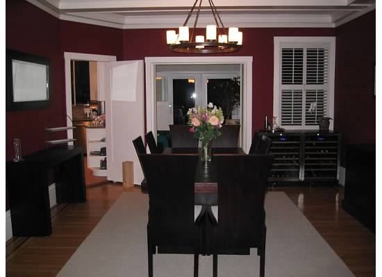
And, After. Mind you, there’s nothing wrong with this room! But once she implemented some changes…. pow!
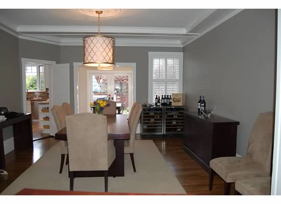
Isn’t that such a great change? The room is so clean and bright. Loving that quatrefoil pendant lamp – I hope the “quatrefoil craze” continues for a while – so classic, so pretty. (The paint color is Restoration Hardware’s Graphite).
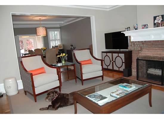
The living room Before:
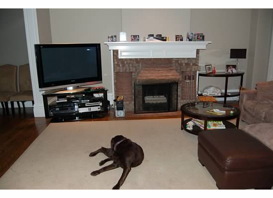
And…presto. Even Wrigley the dog looks better!
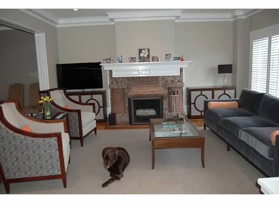
Another shot below. Her style is truly transitional – clean, modern, classic. Loving that paint color, by the way… you can’t go wrong with a nubby neutral gray (the exact color is Restoration Hardware’s Stone).
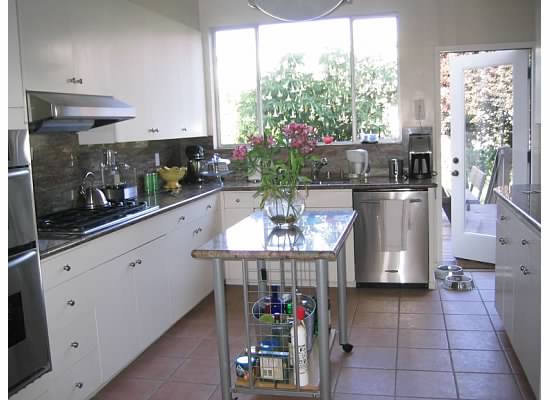
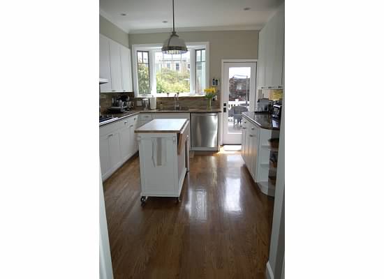
Just look at how different this kitchen is, Before:
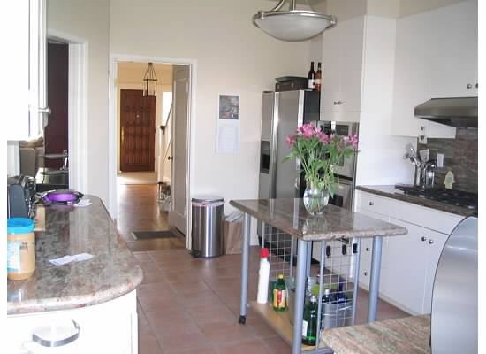

A new kitchen “island” (from Crate & Barrel, I believe), newly painted walls, new cabinet doors, hardwood floors and a new light fixture. It really transforms the space.
Another shot – Before:
And After:
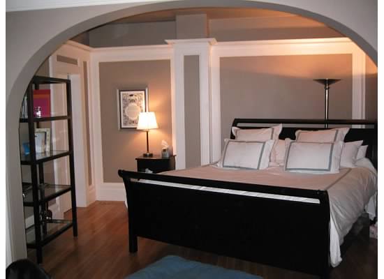
One of my favorite change-ups is the master bedroom. Because of the construction of the room, they originally had to position the bed sort of at a diagonal…
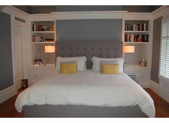
Some new built-in shelves and a distinct place for the bed… and wow – what a difference!
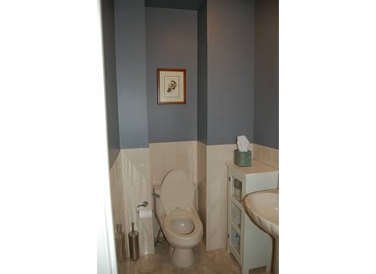
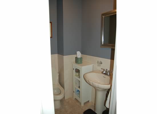
Check out this amazing transformation. Here we have a run-of-the-mill powder room. It’s not bad! Totally fine!
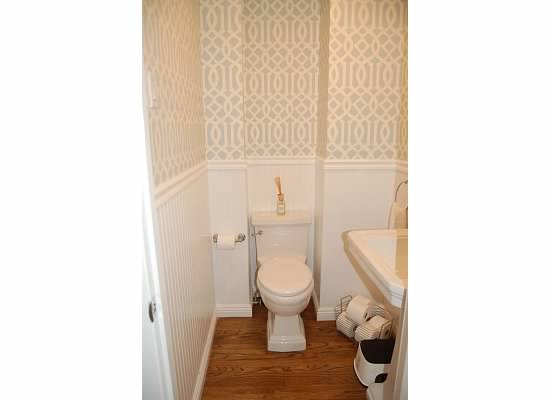
But wow, what a difference some beadboard, wallpaper and new floors make. Here is the after:
Another shot, Before:
And After:
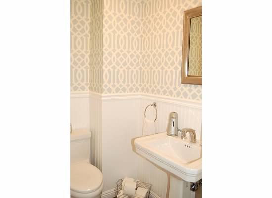
The wallpaper is Schumacher’s “Imperial Trellis” (designed by Kelly Wearstler!) that never gets old. I wonder if my friend Carey knows that Chloe Sevigny also put this wallpaper in her powder bath??
Carey and her husband Noah recently purchased a beautiful new home, also in San Francisco, and plans are already afoot for some pretty serious changes. I don’t know about you but I’m seriously excited to see what they do. Carey, bravo on a beautifully transformed space and thanks for inviting us in!
Carly Bean
July 21, 2018 at 6:41 PMHello, do you happen to know the name/brand of the gray exterior paint? Thank you.
Lorri Dyner
January 23, 2019 at 3:06 PMHi Carly, I DON’T know the exact color! But try looking at Stonington Gray by Benjamin Moore, which looks REALLY close to this color and is the color that keeps on giving. If you search it on Pinterest, you’ll see it everywhere and see if it’s the color you’re going for.